 Earlier this week, I started worrying less about all of the barriers to entry in prepping my short film “Abyss” for its release; and began to notice the many ways that I can leverage the (albeit limited) resources I already have access to, for maximum options – including the creation of key art. The search for a movie poster design that best represents “Abyss,” however is still on, bringing us to another common trend among one-sheets.
I figure it’s worth considering any and all viable design concepts that could work while also identifying the ones that should be avoided like the plague.
So with that in mind, let’s look at some movies with posters that could easily pass for another film in front of audiences. In Christophe Courtois’s compilation A little resemblance, he describes how the study of small similarities between one movie poster and another makes a big difference in being able to identify traces of unoriginality among their designs.
It’s hard to argue with his implications after just one glance at these design patterns. Films with movie posters similar to previous releases appear to be riding the bandwagon of another title’s box office success or public status. That should be no surprise considering the nature of Hollywood – the land of questionable sequels and remakes. So it seems as though one-sheets are no exception to this rule. Why reinvent the wheel when another movie has shown that certain compositions, colors, etc. work when it comes to gaining audience recognition?
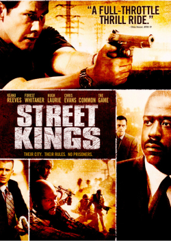
Movie Poster Trend #12 - The Rip-Off
“These are supposed to either remind you of another (and much better) movie or outright trick you into believing you’re actually getting this other movie at the videostore.” - Para1/ONTD
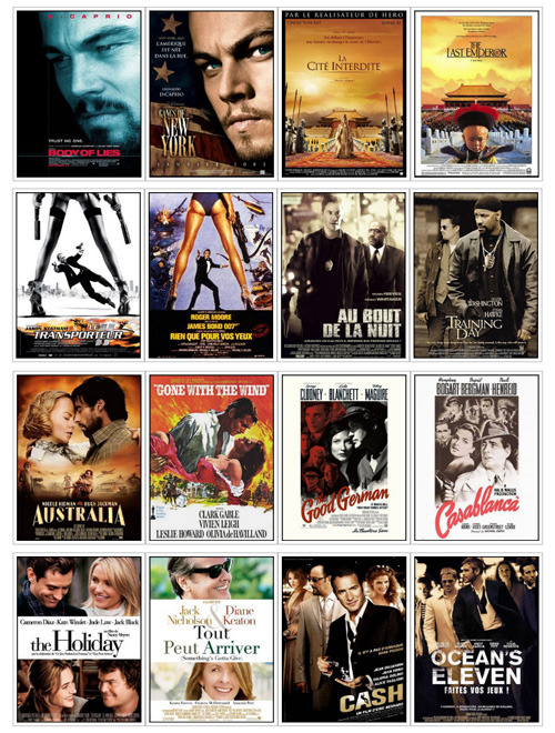
Call it lack of originality, a case of false advertising, or the simple form of being a downright copycat. One thing’s for sure, movies adopting this “resemblance” practice that Cristophe is referring to has succeeded in getting people to take notice. I have no problem with that, since it is the whole point of creating movie posters. Yet, there is also a part of me that wonders if such a move in design choices are made at the sacrifice of a film’s credibility in terms of its perceived value among audiences.
As “The Rip Off” movie poster trend suggests, some people may view these types of designs as a form of trying to compensate for a film that isn’t so good. On the flipside, one can also argue that similarities in poster designs are useful for helping to give some movies the extra push that they need -- an advantage that would otherwise not be possible due to limitations in their marketing budgets, difficulties in reaching a target demographic, or related factors.
Do YOU still consider movie posters “original” artwork if their designs are similar to notable films?
Is this practice of emulation among poster designs, as understandable as the sampling and/or song remixes done in the music business?
Previous installments of Movie Poster Trends series include a post on hidden face designs and another about text-over-faces.