Urbanworld Film Festival 2024

Movie Review Coming Soon!

Directed by by Frank Sputh, Bin Martha, Kolumbianerin (I'm Martha, Colombian) is a slowcumentary, the nearly three-hour portrait of a young Afro-Colombian woman, a slow, closely observing documentary.

Watch 'Slapped Straight'

Now available to rent for 48 hours.

Give the Gift of World Cinema! Order The Madlab Post eGift Cards

Expressway Cinema Rentals is Philadelphia's leading photo & video rental resource for the creative community.

Visual Jedi LLC | Specializing in Video Production from concept to creation. Storyboard, audio mixing, editing, graphics design and more!

Pour something different! Premium specialty loose leaf teas sourced in Africa. Sibahle - We Are Beautiful!

The Ultimate Vegan Experience! We are Vegan Soul. Celebrate a new way of life with healthier food.

Fine Art Reproductions - Limited Edition Giclees on Canvas and Limited Edition Prints by World-Renowned Visual Artist and Designer, Synthia SAINT JAMES


Read my A to Z Reflections:

The Madlab Post is Home to the weekly Monday Movie Meme: Signup!

Are you ready for the best blog hop on the net? #atozchallenge

*All 31 "Prompts" might not be featured on this blog; I have my own schedule and topics to adhere to.

Your ad could be here, right now.

Search


Come SUPPORT the makers and SHOP for the holidays at MADE@BOK Small Biz Saturday Market where you can get a head start on The Madlab Post’s Shop Small Treasure Hunt with movie tickets, videogames and more! This is a market featuring crafts from artists, designers, makers and small businesses that create within the walls of the historic Bok building. Free entry!

FOR YOUR CONSIDERATION:
Perspectives directed by Neer Shelter has qualfied for the 2024 Academy Awards

WATCH IT NOW

#Oscars #Shortlist

FYC: Academy qualified short film 'Perspectives' directed by Neer Shelter | Oscars Shortlist

MANHATTAN SHORT ADVANCE SCREENING PASSES NOW AVAILABLE. 

RESERVE YOUR SEAT

📣 MADE @ BOK SPRING MARKET IS HERE 📣 Our first Market of 2022! On Sunday, May 1st from 11-4pm, come grab a gift for mom, a treat for your loves or something to brighten up your life in the way only springtime can like clothing, jewelry, ceramic and vintage wares, a brownie or two (or five), and more! 🤗 We'll be setting up in the gym as well as all the shops in retail row through the (new and improved!) Dudley St door.

See you then! ❤️🧡💛💚💙💜🤎🖤🤍

Rent Abyss: The Greated Proposal Ever, a short film made with a diverse cast & crew working together to tell a story about Love, Friendship and PTSD! This urban military homecoming drama is a candid glimpse into the troubles surrounding a U.S. Army Sergeant who gets stranded by SEPTA in the inner city when a wild marriage proposal shakes up his plans to reunite with the only family he knows. 

The 2019 Short Film Slam Round V Championships is showing at Motor House in Baltimore, MD. Visit the Shop for Advance Tickets to our awards showcase!

UPCOMING SCREENINGS:

GET TICKETS!

GET TICKETS!

GET TICKETS!
RESERVE YOUR SEAT for February - March 2019!

--------------------------------

The Madlab Post showed all of the 2019 OSCAR Nominees for Best Short Film in the Animation, Live Action and Documentary categories earlier this year. Missed the show? Get on our mailing list!


Bring The Madlab Post to You!

Enter your email address:

Delivered by FeedBurner

Wednesday
Sep112013

Movie Poster Trends – The Secret Appeal of Reading Faces

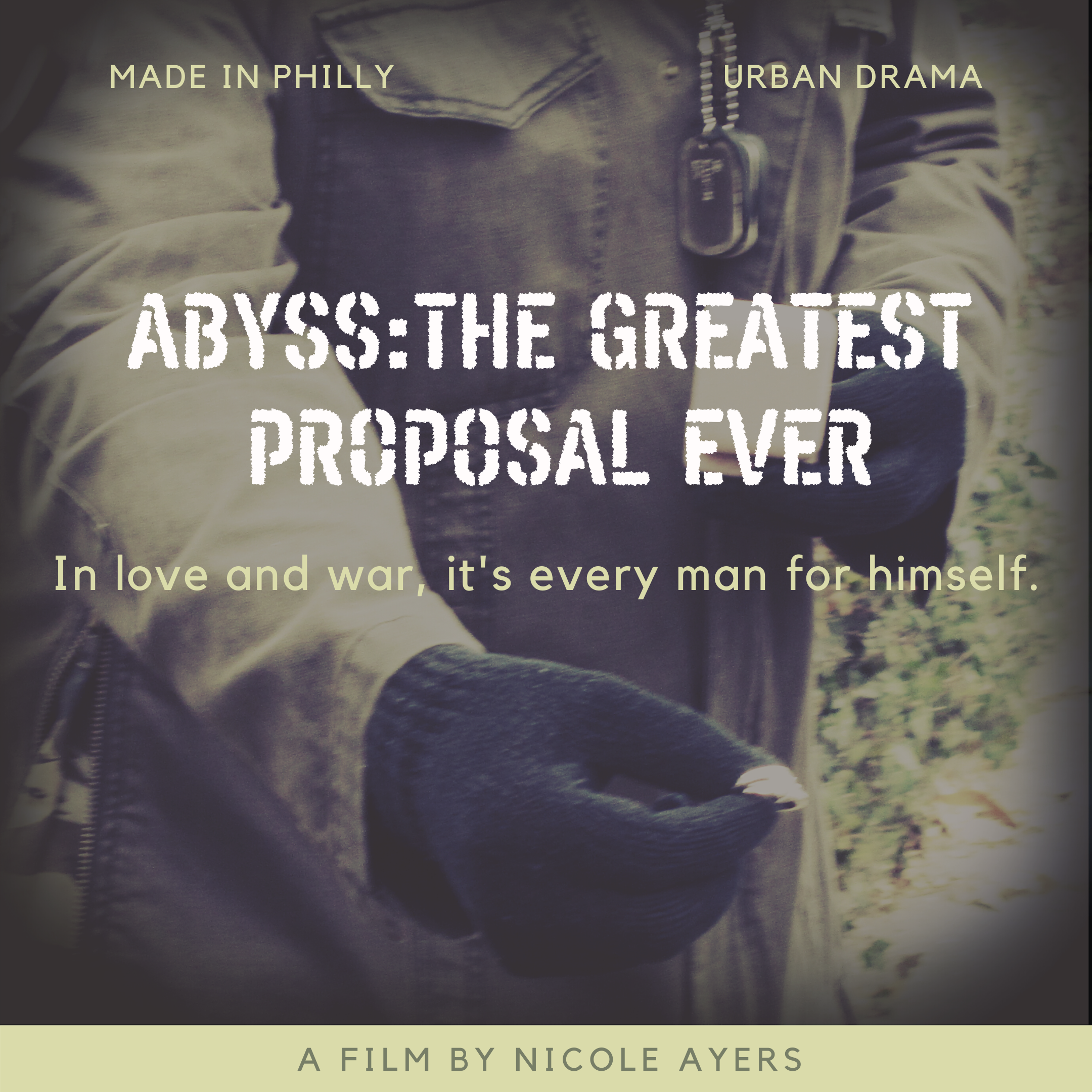
As our look at movie poster trends and what they say about the films they’re representing continue, here is another one that I’m considering for my short film, “ABYSS.” Designers behind these posters took the saying “It’s written all over your face” literally, placing it front and center in these marketing materials.

In Text, Faces and Movie Posters, French blogger Christophe Courtois points out an emphasis on punch lines – with placement on the nose, forehead or mouths of the films’ protagonists.

Posters for movies such as the adventure-fantasy flick “Thor” starring Natalie Portman and Chris Hemsworth as well as mockumentary “I’m Still Here” starring Joaquin Phoenix and (one of the most memorable being) the biographical drama “The Social Network” starring Jesse Eisenberg, Andrew Garfield and Justin Timberlake all utilize text as one of, if not the main, focal points of their design.

Movie Poster Trend #13 - Text in Your Face

This trend is fairly new; basically a lot of bandwagon marketing. But in this case the typeface and the way it’s arranged on the poster at least gives you an idea of the amount of artistic pretention involved. -Para1/Oh No They Didn’t! (ONTD)

Say what you will about this text-over-face trend in movie posters, but in terms of design, I think the poster for the romantic sci-fi thriller “The Adjustment Bureau” starring Matt Damon, Emily Blunt and Anthony Mackie is especially useful for producers of independent film, to study.

It provides enough information to viewers without relying on Damon’s (or even to an extent, Blunt’s or Mackie’s) star power to attract interest in the movie. It doesn’t take long to quickly understand what “The Adjustment Bureau” is about, possibly even becoming intrigued by the mysterious figure in the background, which adds to the curiosity and/or anticipation of what this film has to offer you.

While there is a version of “The Adjustment Bureau” poster that does feature Damon and Blunt as one of the main design elements, I think the one with the mystery-man layout shows me there is potential for movies like “ABYSS” to stand out -- by finding a catch phrase or something that could be the main focal point without featuring photos of anyone in the film.

Since independent films tend to feature relatively unknown actors, the somewhat abstract nature of “The Adjustment Bureau” poster lends a hand to those of us who are working with limited production, post-production and marketing budgets. It’s a win-win for audiences and for filmmakers. I don’t have to feel bad about not being able to woo and afford the likes of Tom Cruise or Halle Berry for my movie and viewers don’t have to look at the poster and say “Who the hell is that person? I’ve never heard of him or her!”

Stressing text over imagery rather than the other way around allows the designer and the producer (which would be me, where “ABYSS” is concerned) to present a clear, yet, basic message about the movie and not have to worry about finding a fancy concept that makes it look all “Hollywood.” In fact, I don’t even want to go for the tinsel-town type of look because doing so could potential throw people off from what my movie is about, given that the story involves a reality show, of sorts.

Do YOU think text on faces in a movie poster is distracting, or can it help add to the overall image?

Are YOU more likely, or less likely, to pay attention to text over abstract (or faded or blurry) forms versus clear photos of people on movie posters?

*If you missed the previous installment of this Movie Trends series, READ IT (Movie Poster Trends – Hidden Faces) HERE.

Monday
Sep092013

Monday Movie Meme – Roll Credits, Already!

Last week, I rented “Adaptation” starring Nicolas Cage and Meryl Streep, from Blockbuster but did not watch this movie in its entirety. The film didn't keep my attention enough to warrant spending any more time than necessary on its story or characters – which got me wondering how many times any of us have watched a movie that caused us to re-direct our energy towards other, more enjoyable, activities. Thus, need I say more about this week’s Monday Movie Meme? I think not: Roll Credits, Already!

Share on your blog or in the comments section, movies that you purposely stopped watching mid-way through. Maybe the flick offended you. Maybe there was too much (or too little) going on in the story. Maybe the genre of the film is just not your cup of tea, no matter how hard you try to give it a shot. Or maybe the movie just sucks, for whatever reason. Actually, you didn’t even have to make it that far – films that lost your vote after only a few scenes in are also included, making my list for this week’s “Roll Credits, Already!” theme longer than usual.

I do plan on trying to watch a few of these movies again, just to give them another looksee in case they really are worth at least one full viewing. I mean, why give up on a film so easily when it has the potential to become one of your favorites?! Just sayin…

Salt – I had high hopes for this action film about a CIA agent accused of being a Russian Spy. After all, it stars Angelina Jolie and I like a lot of her films. Unfortunately, I turned it on, watched a few scenes – it started to feel like a long ass dry story about people doing nothing and talking about nothing, so I turned it off. No deal!

Nights and Weekends – I really wanted to like this movie, especially because I enjoyed viewing a handful of other films starring and/or made by Greta Gerwig and Joe Swanberg. This particular one, about a couple and the decline of their long-distance relationship, just didn’t do it for me, so I clicked the “STOP” button to save enough remaining minutes on my (then) limited Netflix streaming plan, for me to watch something else.

1408 – I like some of John Cusak’s work. I like some of Samuel L. Jackson’s work. So you’d think I have a winner here, right? Yeah, I did too. I watched the beginning of this mystery horror flick about an author (or journalist or whatever) who stays in a hotel room said to be haunted, so he can investigate the validity of its infamous reputation.

The movie seemed promising but it didn’t take long for me to tune out of the story. I did watch the end of the film, just to see if things got more interesting. They did per se but not the way I had hoped – instead, things got kinda weird. To this day, I’m not sure if that’s a plus or a minus for the flick.

The Real Cancun – Yes, I get it -- I should’ve known better; still, I think this was the first movie (or one of the firsts) that I ever rented from Netflix. Big mistake! It doesn’t have a story – like, not even in its Spring break infused reality world. There’s no real drama, comedy or action anywhere in this movie, worth latching onto. My family’s home videos from Thanksgiving holidays past feature more interesting characters than those starring in “The Real Cancun.”

Psycho – Yeah I know, I know….some of you are probably like “What???!!! – she doesn’t have a clue” but bear with me for a minute. I did turn it on and I did watch this legendary horror flick – just not for long. So, I turned it off not long after the beginning of the movie. It’s a simple as that.

Amistad – Looking back on when I first checked out this historical drama about a free man involved in a mutiny on a slave ship in the 1830s, my mood was probably leaning towards lighter fare. Anyway, I remember feeling like it takes too long for the story to evolve. Anytime I’m thinking “when are we going to get to the good parts?” that is not a good sign. So, I stopped watching it. Perhaps, the length of the entire film – being damn near three hours, didn’t help the situation.

(500) Days of Summer – I love me some Joseph Gordon-Levitt, which is one of the reasons why I might give this romantic comedy about a brokenhearted guy who reflects on the highs and lows of his previous relationship, another viewing. Despite being a quite popular independent film, I found it to be so annoying the first time I tried to watch it that I turned it off without hesitation.

The Box – This movie is so beyond retarded that even the few scenes I did manage to watch were still a waste of my time.

Breathless – Maybe being an old, black and white flick did not help this movie’s case, but, that’s not why I lacked the patience to watch Jean Luc Goddard’s classic piece about a newspaper saleslady who unknowingly gets involved in a crime spree after meeting a thief. Although I turned this movie off during my first attempt at watching it, I’m giving it a second try, given that it is praised among the standout titles in the history of cinema, and all.

Sherlock Holmes – I didn’t spend more than 10-15 minutes watching this action crime movie. Being set in the 1800s didn’t help, but, the delivery of the story was just not done in a way that kept my attention – even with Robert Downey Jr. in the lead role. I like him; it’s not him that’s the problem, it’s the overall movie that I was not digging. So, something MUST be wrong when I won’t even give a Robert Downey flick some play!

What movies have YOU pressed the “STOP” button on, walked out on, made you change the channel or caused you to ignore it altogether and do other activities while it continued to play in the background?

Would YOU consider giving any of the movies you stopped watching some play a second time around?


Thursday
Sep052013

Movie Poster Trends – When Hidden Faces are a Hit or Miss...

Do you know what Christopher Nolan’s action crime flick “The Dark Knight” starring Christian Bale, Peter Weir’s sci-fi drama “The Truman Show” starring Jim Carrey and Eli Roth’s “Cabin Fever” have in common? Their posters indicate that the movie you’re about to watch might be good…or it could be a dud – all because of its hidden face design.

That’s just one of 13 trends found among movie posters, on a list that I happened across while researching tips and tricks to help me narrow down concepts for my “ABYSS” poster. What these trends say about the films they represent, however, is just as (if not more) hilarious than the actual style being highlighted on this list.

Forgive me if I not only happen to like some of the movies showcased but also think that at least two of the trends offer up some possibilities worth considering when devising a plan for my own movie poster. I will be highlighting these findings, for your viewing pleasure, to find out if you agree or disagree with them. Before we embark on this design journey, however, know this:

  • The poster mash-ups reflecting these trends are based on collages from the French blog Les Sibères Affiches de aka The Sibères Posters: Reconciliations unusual, original compilations, one of the most comprehensive online destinations ever dedicated to film cover art or one-sheets. The blogger, Christophe Courtois, compiles movie posters into a collage focusing on their similarities and then analyzes them – sometimes with humor, other times with a little deeper study. It’s a site that you have to see to believe.
  • The titles and (maybe sarcastic) descriptions and/or observations of what each trend means in terms of the quality and/or content of the film are those of Para1 at Oh No They Didn't! (ONTD).

Now, Let's get this poster party started at one random spot on the list...

Movie Poster Trend #10 - Is That Your Face, Or Are the Drugs Kicking In?

You'll notice the attempt of originality here, even with the Dali (NSFW) rip-off. This means you'll have to tread carefully; it’s very likely that the filmmakers think they're brilliant and original, regardless of reality. – Para1/ONTD

In The Hidden Face Posters,” Courtois says “there are many ways to show a face on a poster without resorting to traditional photography.” I happen to agree with him and could understand the use of this type of design for certain genres such as horror films as well as stories that are mysterious or suspensful in nature. I would not generally deem it appropriate for, say, comedies but you never know...it's all about the layout and what works for the film and whatever message the designer, producer and others behind the movie is trying to convey.

Although "ABYSS" does not fall into the horror or mystery/suspense/thriller categories, I do like the hidden face design -- particularly that of "The Next Three Days" (top row, next to "The Truman Show") starring Russell Crowe -- and think that a similar concept of still photos and collages of scenes from the film over a background made up of bus schedules might work.

I also wonder if the "White Noise" poster (third one in on the last row) concept could work, where I have a cloudy image of one of the scenes from the film placed inside a graphic of a wedding ring and/or video camera lens.


I'm also working on getting a trailer up for the movie -- maybe that would help you guys and gals share your two cents on what could possibly be some good concepts for my "ABYSS" poster. 

What do hidden faces on a movie poster say to YOU about the films they're representing?

Are YOU more likely to want to watch a movie that features a simple photograph, rather than one that incorporates a hidden face design?

Do certain types of designs make you hesitant to want to see a film? 

*Movie Poster Trend and Descriptions: Courtesy of Oh No They Didn’t! (ONTD)

*Movie Poster Compliation: Courtesy of Christophe Courtois at Les Sibères Affiches